(But I can’t promise the drawing would be very good…)
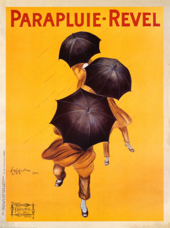
In the text White Space is not Your Enemy, the author states, “Negative space always has weight and structure in graphic design.” I think this poster is an excellent example of that argument. Part of what makes this poster so striking is the vast amounts of negative space being used. There are other advertisements in this style, from roughly this same time period (as pictured below) that also rely on the abundant use of negative space to weigh their design. There is very little to take away from the product being sold, and the bold use of colors allows both posters to draw the viewer in immediately.

These advertisements are also a good example of what Brian Kennedy refers to when he says that visual literacy is a universal language. The umbrella poster is written in French, but you don’t have to speak French to know that this poster is selling. Same goes for the Italian poster for pasta.
The clean, simple, and impactful design of these two posters were evidently successful in making a lasting impression on consumers. A simple Google search for “umbrella poster” or “spaghetti poster” will bring up myriads of hits for both of these works done by Leonetto Capiello. Neither brand, Revel nor Baroni, is still in business today, but some 90 years later, their advertisements are still widely known.
It's so interesting to me that you commented on the fact that one needn't know the language these posters are written in to understand the product they represent. I commented on something very similar regarding the image I wrote about! i also agree with you regarding the use of negative space. Early in my working career I worked in a few art galleries/frame shops and i framed TONS of posters from the same genre. I always steered customers toward selecting chunky but simple frames and mats for these posters in order not to complicate the negative space and detract from the main image, and personally, I preferred not to mat them at all. Too much clutter in the bordering areas actually makes these images go "flat" because your eyes bounce around way too much and never settle in the center as they are supposed to - and the entire effect is lost!
ReplyDeleteJenna
I love hoe you pointed out that you don't have to speak the language to know what the poster or image is trying to says or is trying to advertise. That's important to know.
ReplyDelete-Kayla Owens
Stephanie, I so enjoyed reading your blog post about the Capiello posters. Truly, he was ahead of his time. Because of his wonderful use of bright colors, compelling graphics, and abundant use of white space it's easy to understand why he's known as "the father of modern advertising."
ReplyDeleteWhat stands out for me in both posters: the movement of the figures depicted in the art and the unmitigated JOY that both posters convey to the viewer. Even though it's raining and your umbrella is black, the viewer is made to feel happy! What do you think of the draped fabric over the cuffed pants featured in the first figure? Reminds me of harlem pants or ?? I also like that the figures are not gender-specific. Did you notice the pop of white (gloved hand?) in the upper third of the poster? The lines representing rain? So many wonderful details.
Thanks for sharing your thoughts. Dawn
This comment has been removed by the author.
ReplyDeleteTo paste an image in the comments type this [ img ]your-image-url[ /img ] but remove the spaces inbetween the brackets, and replace "your-image-url" with the the URL for your image. YouTube URLs can be posted as-is
ReplyDeleteSeeing if this works...
ReplyDelete[img]https://s-media-cache-ak0.pinimg.com/736x/94/05/d2/9405d2a4f04e0cdafefb9e0da80e5154.jpg[/img]
https://www.youtube.com/watch?v=CvBfHwUxHIk
ReplyDeleteAnd this...
ReplyDeletehttps://www.youtube.com/watch?v=cz69QcDBRPw
https://www.youtube.com/watch?v=CvBfHwUxHIk
ReplyDeletehttps://www.youtube.com/watch?v=CvBfHwUxHIk
ReplyDelete[img]http://s.hswstatic.com/gif/rosie-riveter-1.jpg[/img]
ReplyDelete