(But I can’t promise the drawing would be very good…)
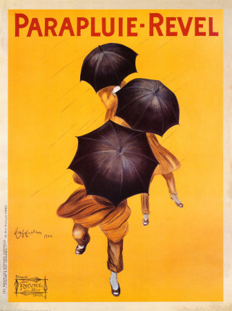
In the text White Space is not Your Enemy, the author states, “Negative space always has weight and structure in graphic design.” I think this poster is an excellent example of that argument. Part of what makes this poster so striking is the vast amounts of negative space being used. There are other advertisements in this style, from roughly this same time period (as pictured below) that also rely on the abundant use of negative space to weigh their design. There is very little to take away from the product being sold, and the bold use of colors allows both posters to draw the viewer in immediately.

These advertisements are also a good example of what Brian Kennedy refers to when he says that visual literacy is a universal language. The umbrella poster is written in French, but you don’t have to speak French to know that this poster is selling. Same goes for the Italian poster for pasta.
The clean, simple, and impactful design of these two posters were evidently successful in making a lasting impression on consumers. A simple Google search for “umbrella poster” or “spaghetti poster” will bring up myriads of hits for both of these works done by Leonetto Capiello. Neither brand, Revel nor Baroni, is still in business today, but some 90 years later, their advertisements are still widely known.